Devonshire Square:
The Bengal Wing
Devonshire Square is a mixed-use campus with office and retail spaces available. They want to differentiate The Bengal Wing from their other office spaces. The challenge was to create an individual and vibrant sub-brand which is still undeniably DSQ by using similar visual language, but has it's own unique spin to stand out.


Devonshire Squares existing branding is vibrant and centred around our botanical Illustrations. This evokes a brand that is contemporary with a root in the proud spice heritage of Devonshire Square’s trading hub history. So it was important the new brand matched this energy as well.
The Existing Brand

The logo mark makes use of the same font as the DSQ brand, and includes a small DSQ logo on the right hand side to ensure integrity. The lock-up is simple and differs from the rest of the DSQ brand.
Logo


To separate this sub-brand from the rest of the brand, I thought it was a nice idea to draw inspiration from the animal world as opposed to plants. I developed the idea for the Bengal Wing to make use of illustrations of a peacock. This is inspired by the Bengal name, as the peacock is an iconic animal and symbol prevalent in the Bengali area. I explored many options such as the Bengal Cat, Tiger, Monkey and more animals, but I believe the delicate nature of the Peacock feather made is visually harmonious with DSQ’s botanical illustrations.
Visual Language

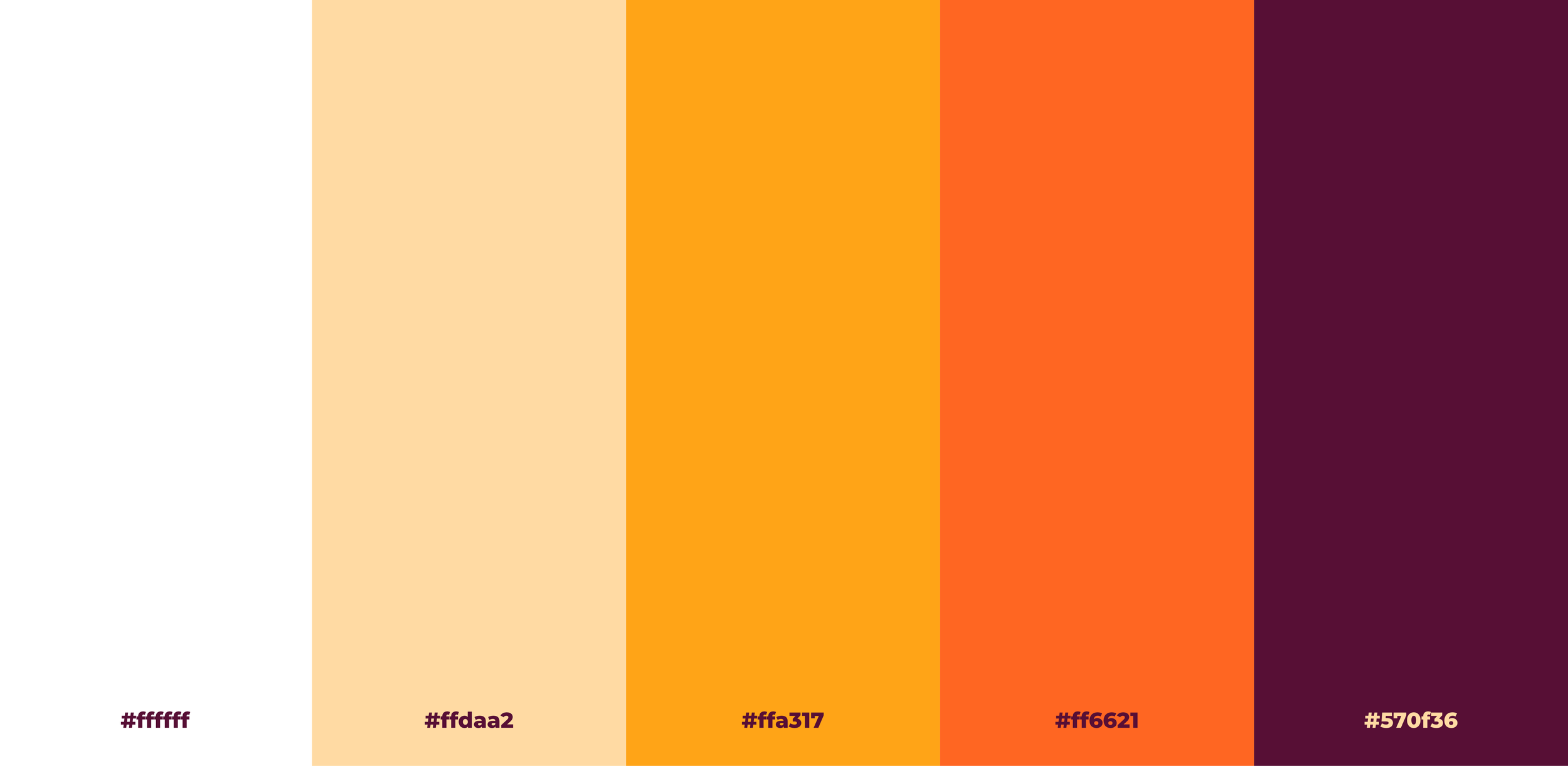
The colour palette combines colours from the existing DSQ colour palette and some new colours so it feels related to the existing DSQ brand, but living in it’s own world. The rich vibrant colours take inspiration from colours found in South Asian and Bengali fabrics and patterns.